5. Represent extracted variables into waffle plots
5.1. Modules requirement
5.1.1. Import external modules
[1]:
import cufflinks as cf
cf.go_offline(connected=True)
cf.set_config_file(colorscale='plotly', world_readable=True)
import plotly.graph_objs as go
import pandas as pd
from pathlib import Path
import os
5.1.2. Import openalea modules
[2]:
from openalea.mtg.algo import split, orders, union
from openalea.mtg.io import read_mtg_file, write_mtg
5.1.3. Import strawberry modules
[3]:
from openalea.strawberry.import_mtgfile import import_mtgfile
from openalea.strawberry.analysis import extract_at_plant_scale, extract_at_node_scale, extract_at_module_scale, df2waffle, plot_waffle, plot_pie
5.2. Import MTG
[4]:
mtg1 = import_mtgfile(filename= ["Gariguette"])
metaMTG= import_mtgfile(filename=["Gariguette", "Capriss"])
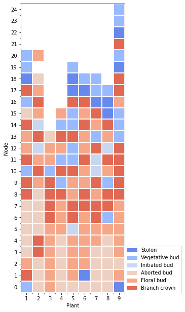
5.3. Waffle plot at node scale
5.3.1. Create the waffle dataframe
First we extract the data at node scale, then the waffle is computed for: * a selected data (here the last one) * a variable in the extracted data
[5]:
df = extract_at_node_scale(mtg1)
date = df['date']
variable = 'branching_type'

tmp = df2waffle(df, index='rank', date=date[len(date)-1], variable=variable)
5.3.2. Plot the waffle
The waffle plot has a default template for the layout, but it can be manually provided.
[6]:
l_names = {"1":"Stolon",
           "2":"Vegetative bud",
           "3":"Initiated bud",
           "4":"Aborted bud",
           "5":"Floral bud",
           "6":"Branch crown"}

yticks_l =list(range(0,len(tmp.index)))
yticks_l.reverse()
layout={
    'xlabel': 'Plant',
    'xticks': range(0,len(tmp.columns)),
    'xticks_label': range(1,len(tmp.columns)+1),
    'ylabel': 'Node',
    'yticks': range(0,len(tmp.index)),
    'yticks_label': yticks_l,
}
Plot the waffle dataframe
[7]:
fig=plot_waffle(tmp,
                layout=layout,
                legend_name=l_names,
                plot_func='matplotlib')
# fig
Three library are available for the ploting: * ‘matplotlib’ * ‘plotly.imshow’ * ‘plotly.heatmap’
[8]:
fig=plot_waffle(tmp,
                layout=layout,
                legend_name=l_names,
                plot_func='plotly.heatmap')
fig
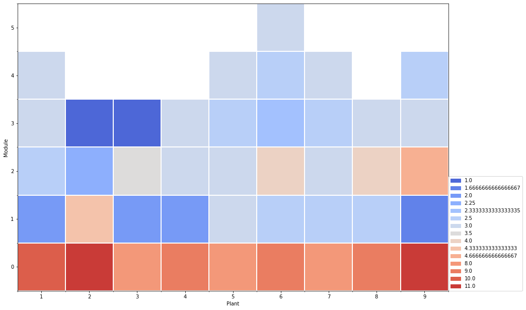
5.4. 3. Waffle at module scale
5.4.1. 3.1 Create waffle dataframe
At module scale, the values are aggregated for each module. The aggregate function can be: * ‘mean’ * ‘median’ * ‘lambda x: ‘ ‘.join(x)’, for qualitative variables
[9]:
df = extract_at_module_scale(mtg1)

date = df['date']
variable = 'nb_visible_leaves' # quantitative variable example: nb_visible_leaves
aggfunc = "mean" # quantitative: "mean", "median" | qualitative: lambda x: ' '.join(x)

tmp=df2waffle(df, index='order',
              date=date[len(date)-1],
              variable=variable,
              aggfunc=aggfunc,
              crosstab=False)
5.4.2. 3.2 plot the waffle
[10]:
yticks_l =list(range(0,len(tmp.index)))
yticks_l.reverse()

layout={
    'xlabel': 'Plant',
    'xticks': range(0,len(tmp.columns)),
    'xticks_label': tmp.columns,
    'ylabel': 'Module',
    'yticks': range(0,len(tmp.index)),
    'yticks_label': yticks_l,
}


fig = plot_waffle(tmp,
                  layout=layout,
                  plot_func='matplotlib')
# fig
5.4.3. 3.3 Crosstab
At module scale, the waffle dataframe can be computed with crosstab at the ‘order’ variable.
[11]:
df = extract_at_module_scale(mtg1)
date = df['date']
tmp=df2waffle(df, index='order',
              date=date[len(date)-1],
              variable='stage',
              aggfunc=lambda x: ' '.join(x),
              crosstab=True)


yticks_l =list(range(0,len(tmp.index)))
yticks_l.reverse()

layout={
    'xlabel': 'Stage',
    'xticks': range(0,len(tmp.columns)),
    'xticks_label': tmp.columns,
    'ylabel': 'Module',
    'yticks': range(0,len(tmp.index)),
    'yticks_label': yticks_l,
    'width': 900
}


fig = plot_waffle(tmp,
                  layout=layout,
                  plot_func='matplotlib')
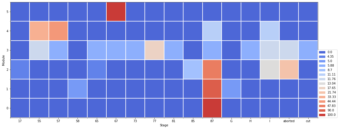
When the crosstab is used, the waffle dataframe can be ploted as pie
[12]:
pie_plt = plot_pie(tmp)
pie_plt.show()